Project Duration: 1.5 years My Role: Product Design, UX/UI Tools: Figma, Jira,
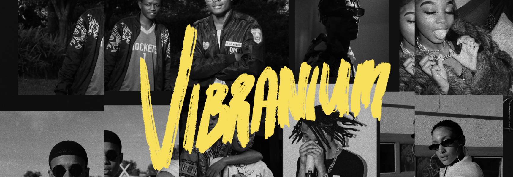
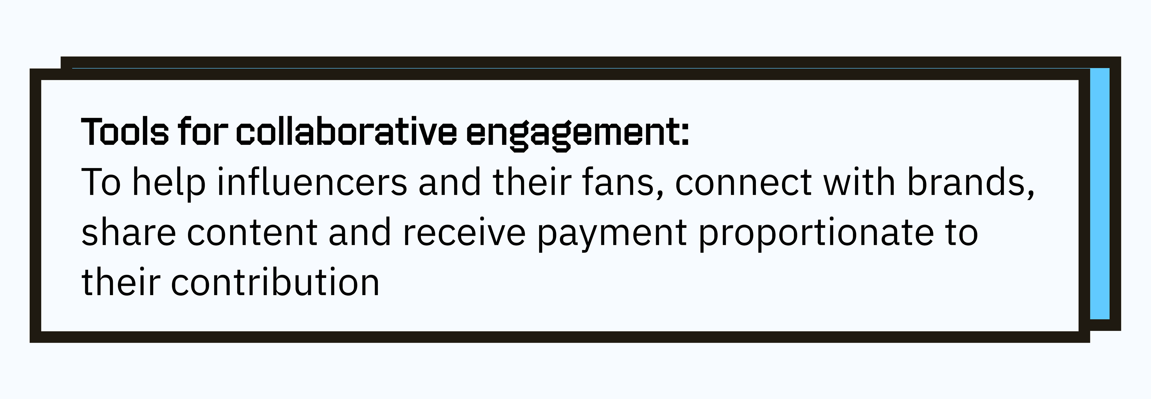
Vibranium is a micro-influencer platform designed to transform how artists, brands, and fans unite
The Situation:
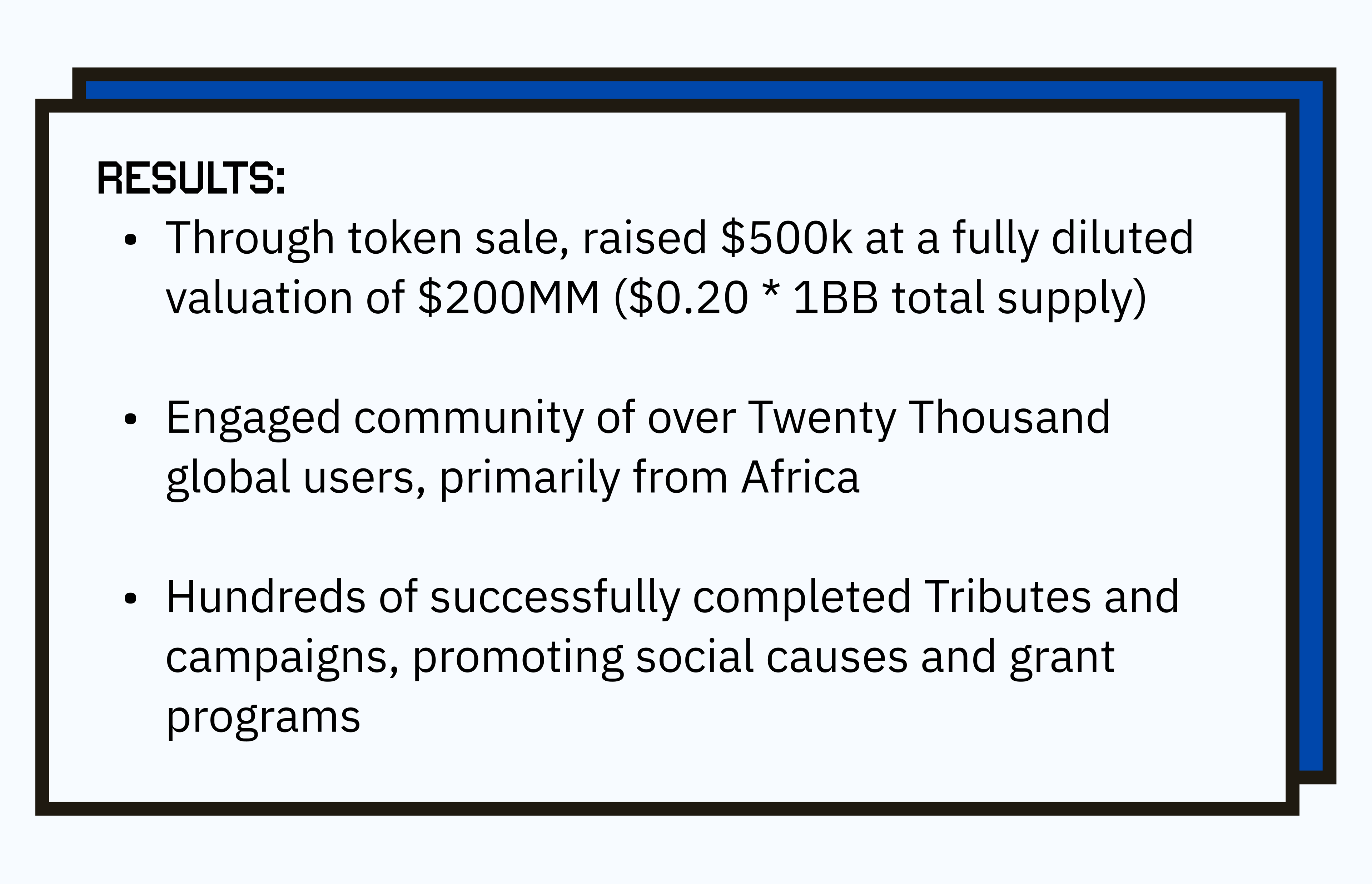
Traditional content distribution and monetization systems are fragmented, heavily intermediated, and often unfair—especially for smaller creators or independent distributors. Vibranium was conceived to leverage Web3 and blockchain principles to improve transparency, accountability, and incentives across the media landscape.
Early Prototype
The Task:
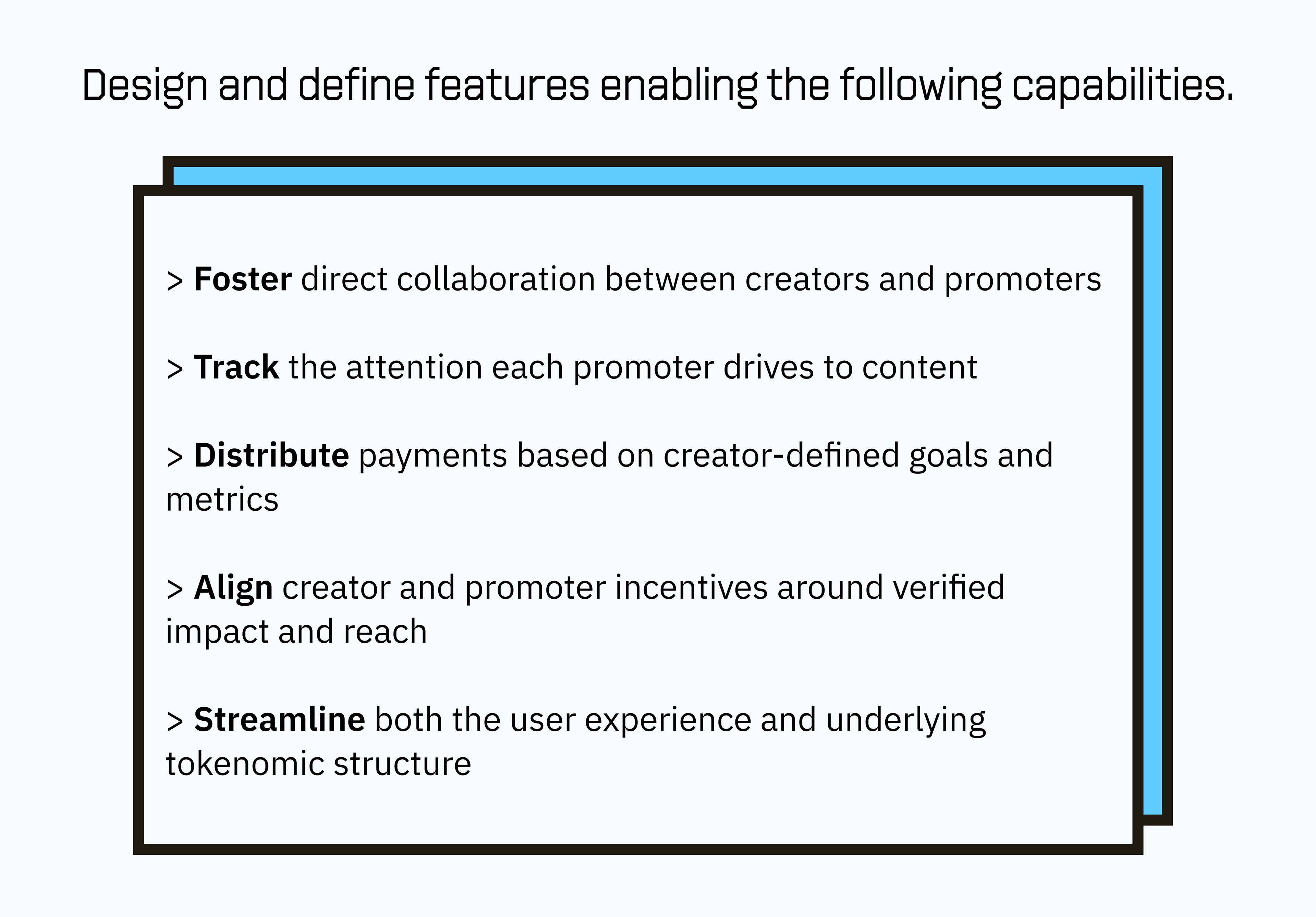
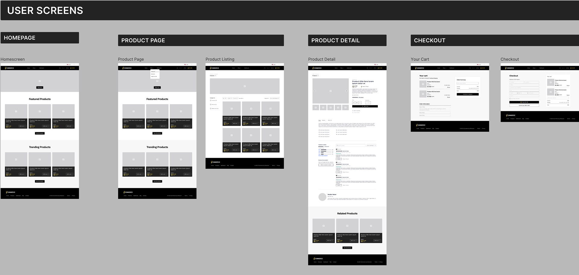
The Actions:
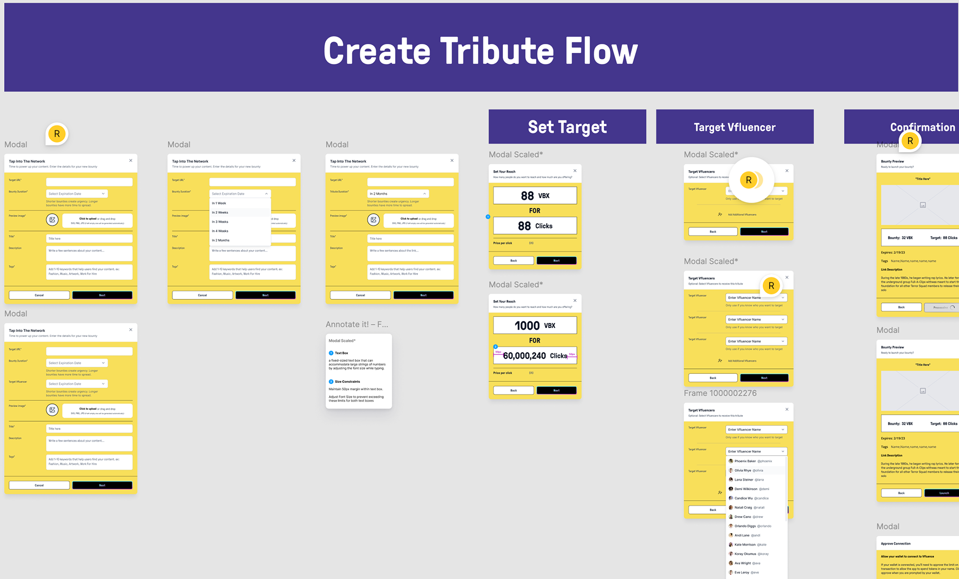
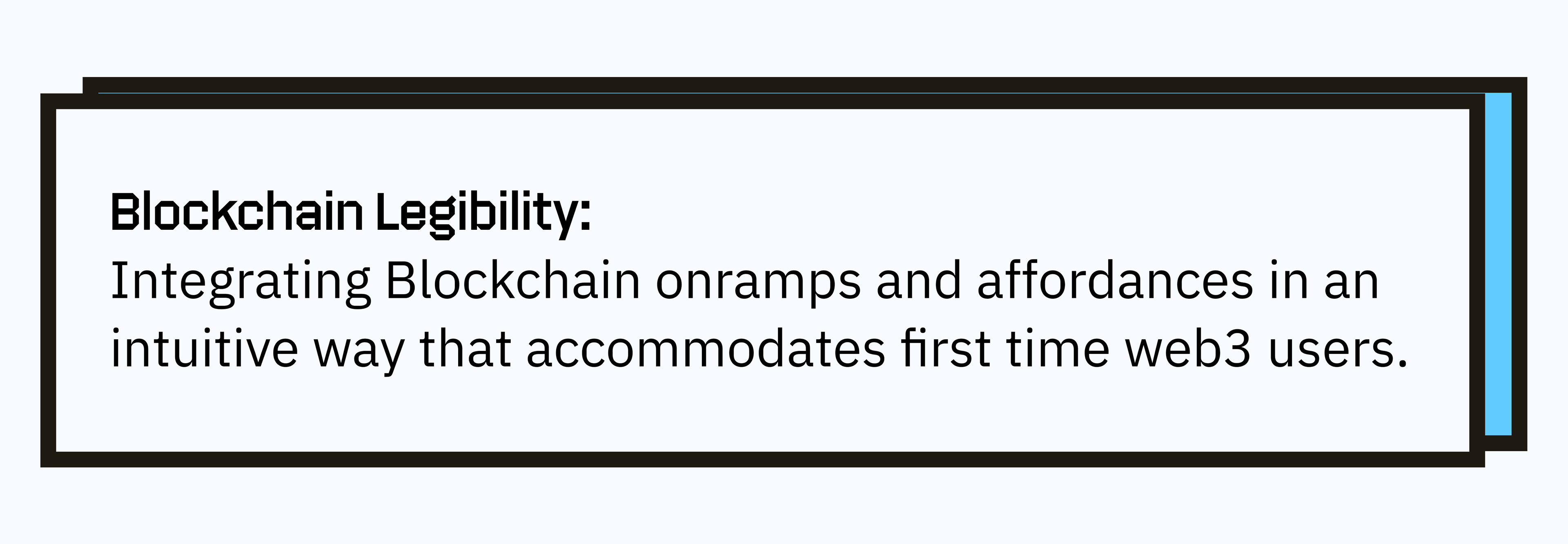
I broke down the task into 5 core requirements, iterating on each with multiple divergent solutions, rounds of user testing and rough prototypes. The features we built needed to shift the orbit of the typical online media economy from value extraction to outcome-alignment and value delivery.
Ideation
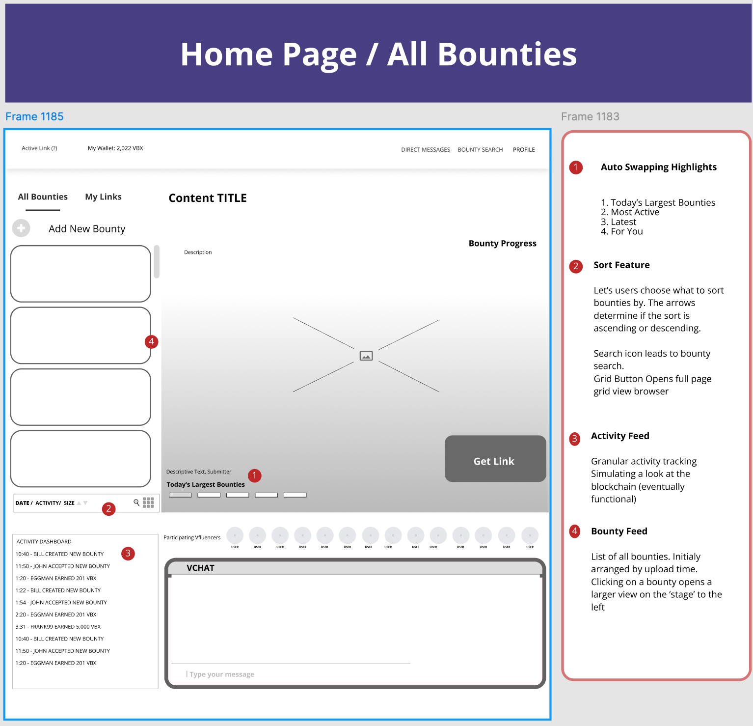
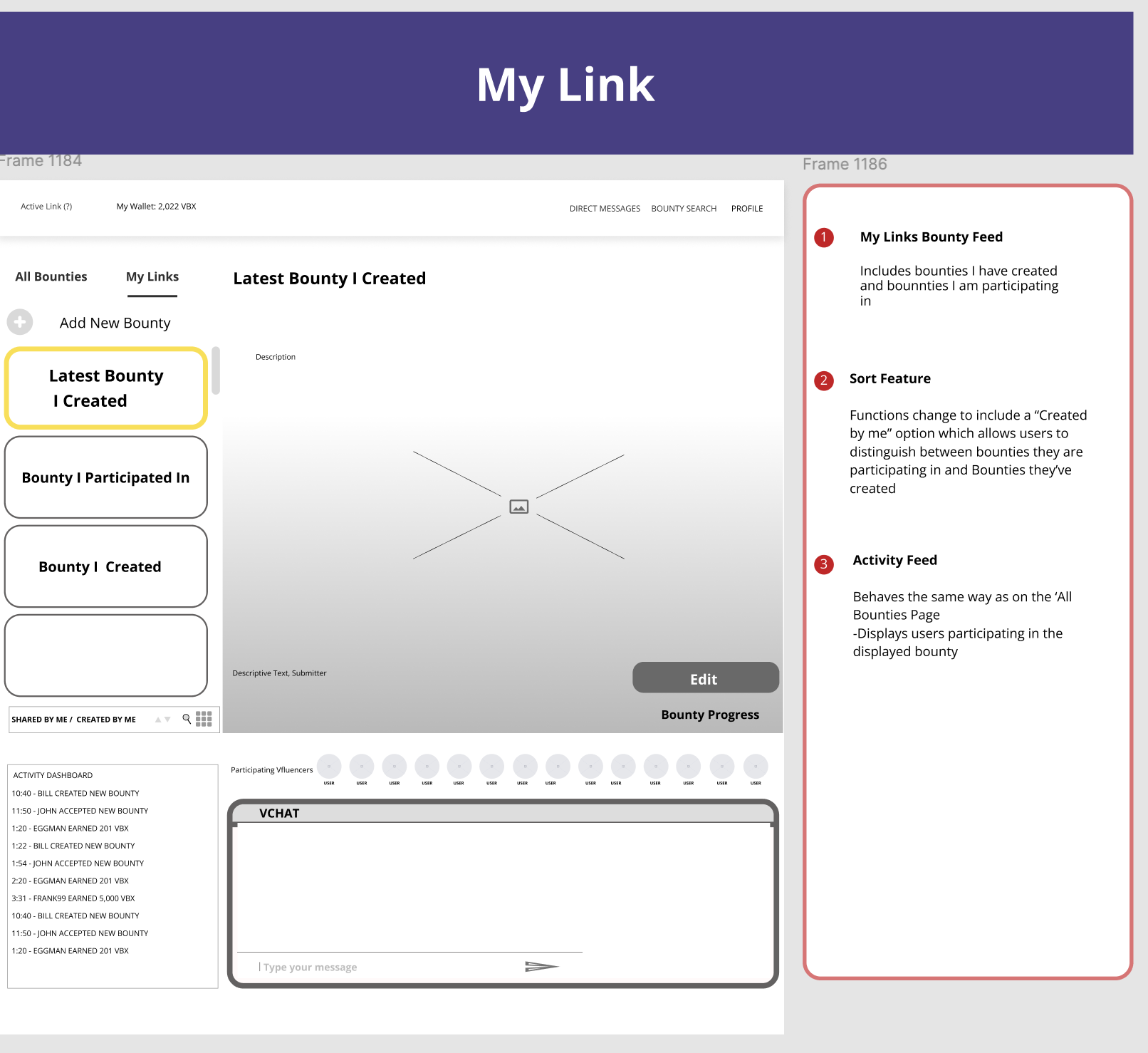
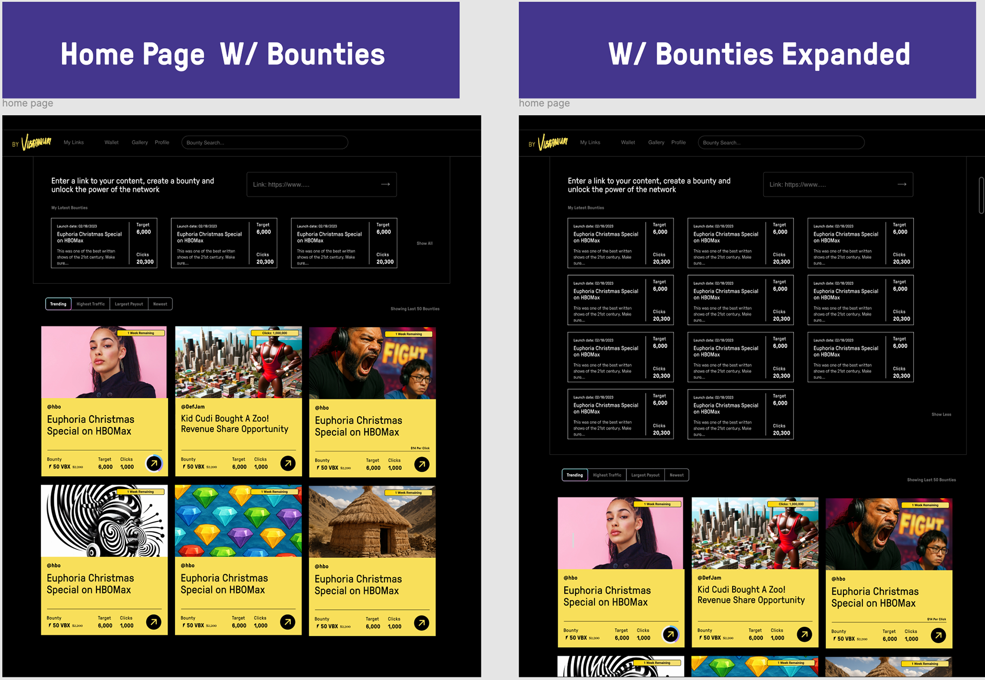
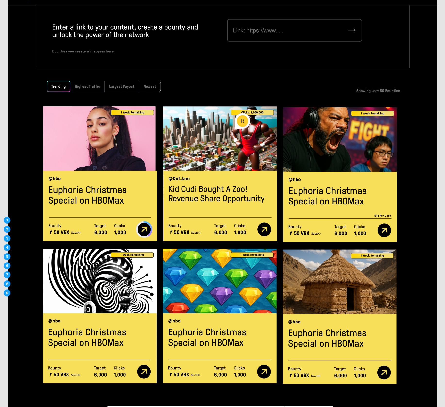
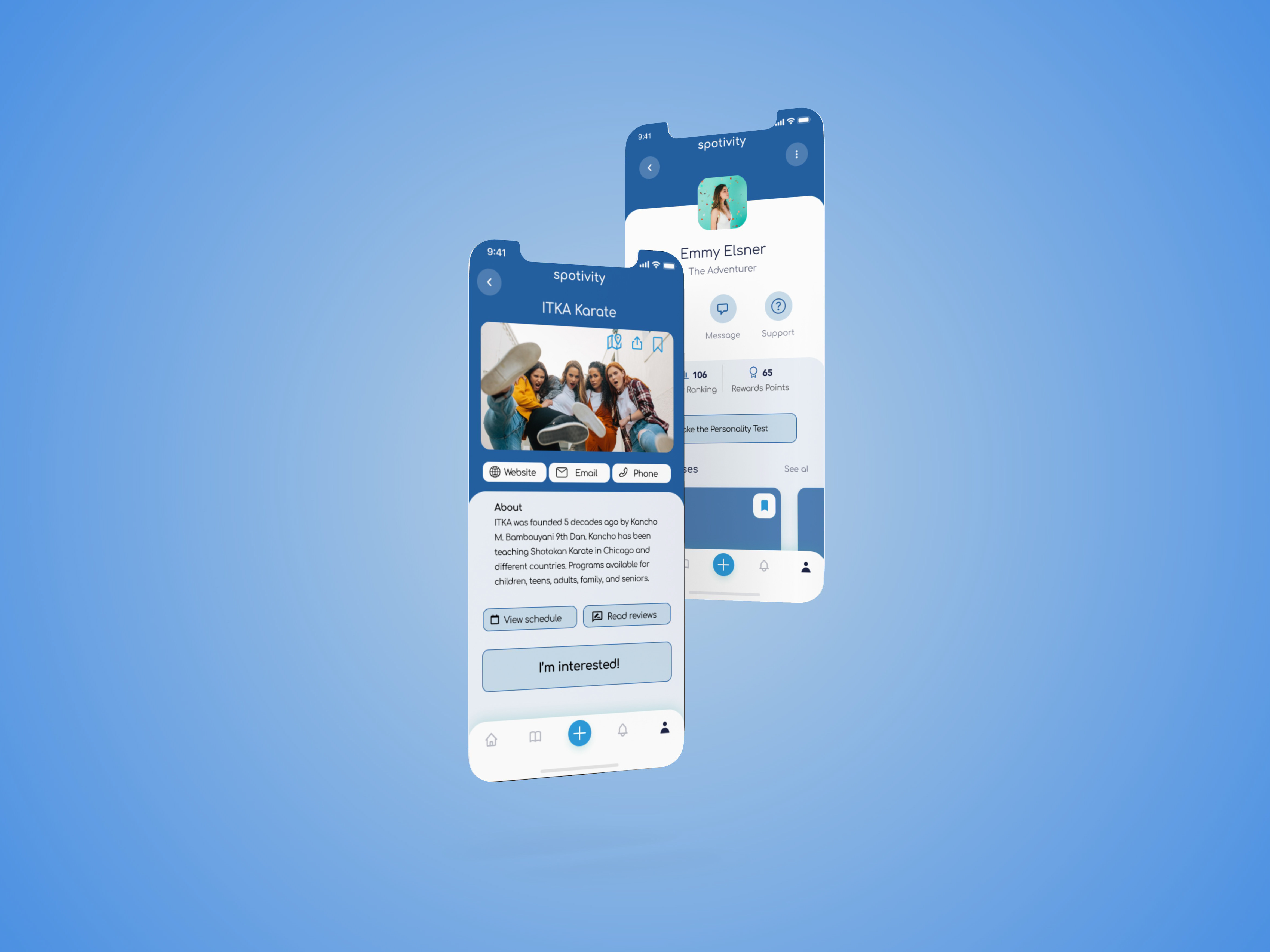
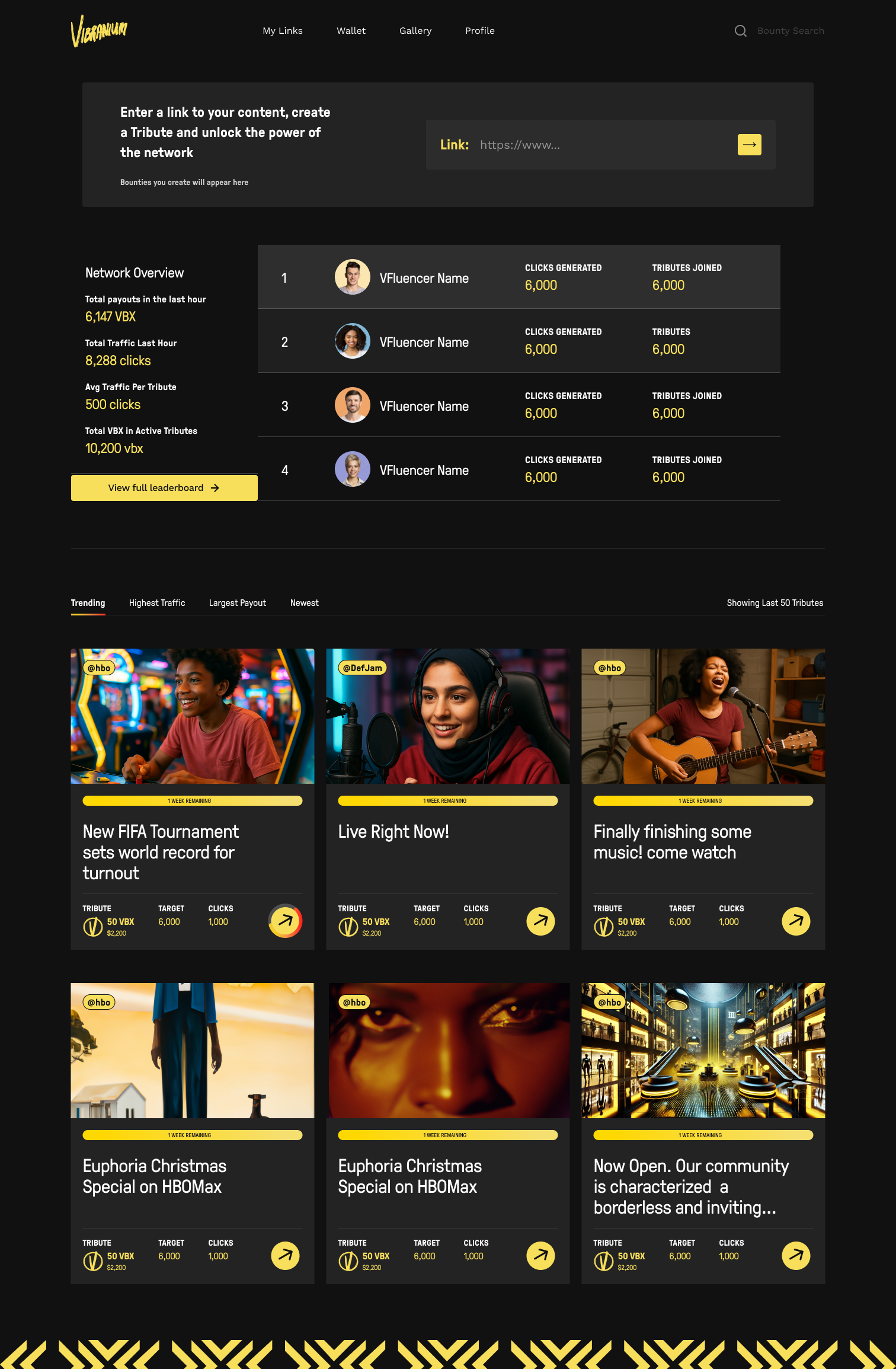
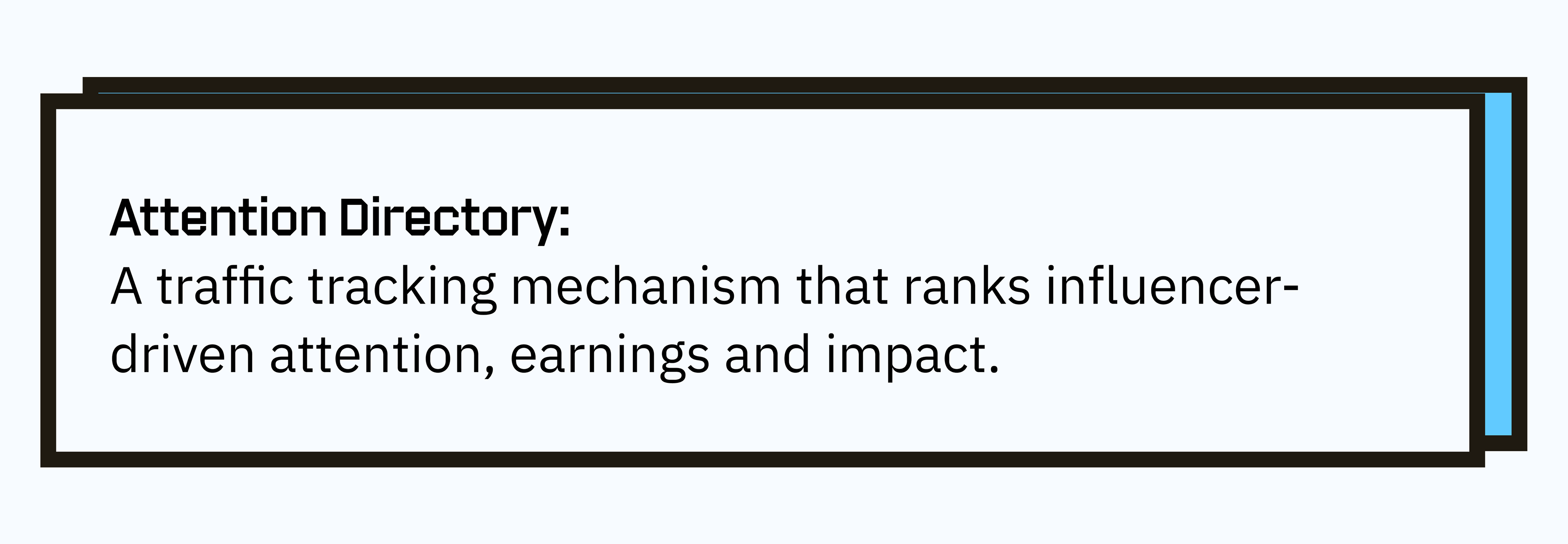
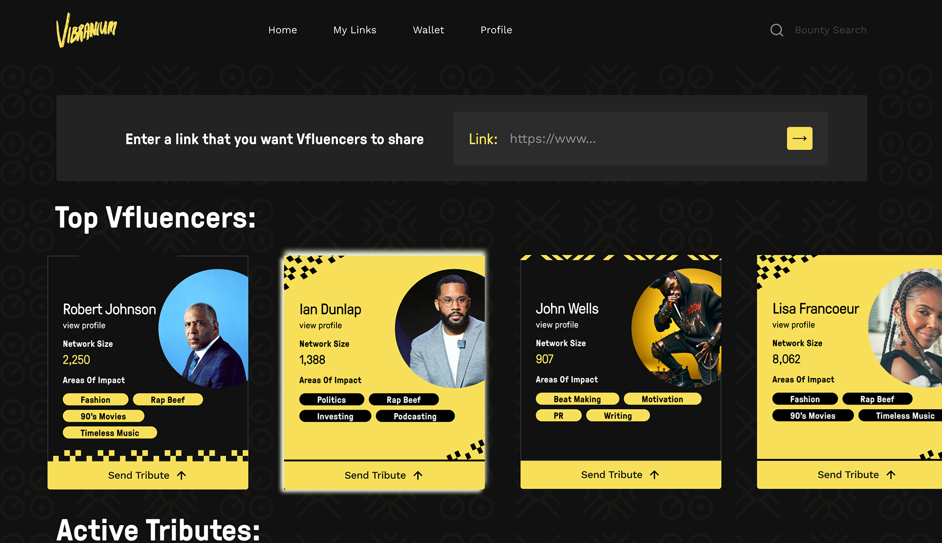
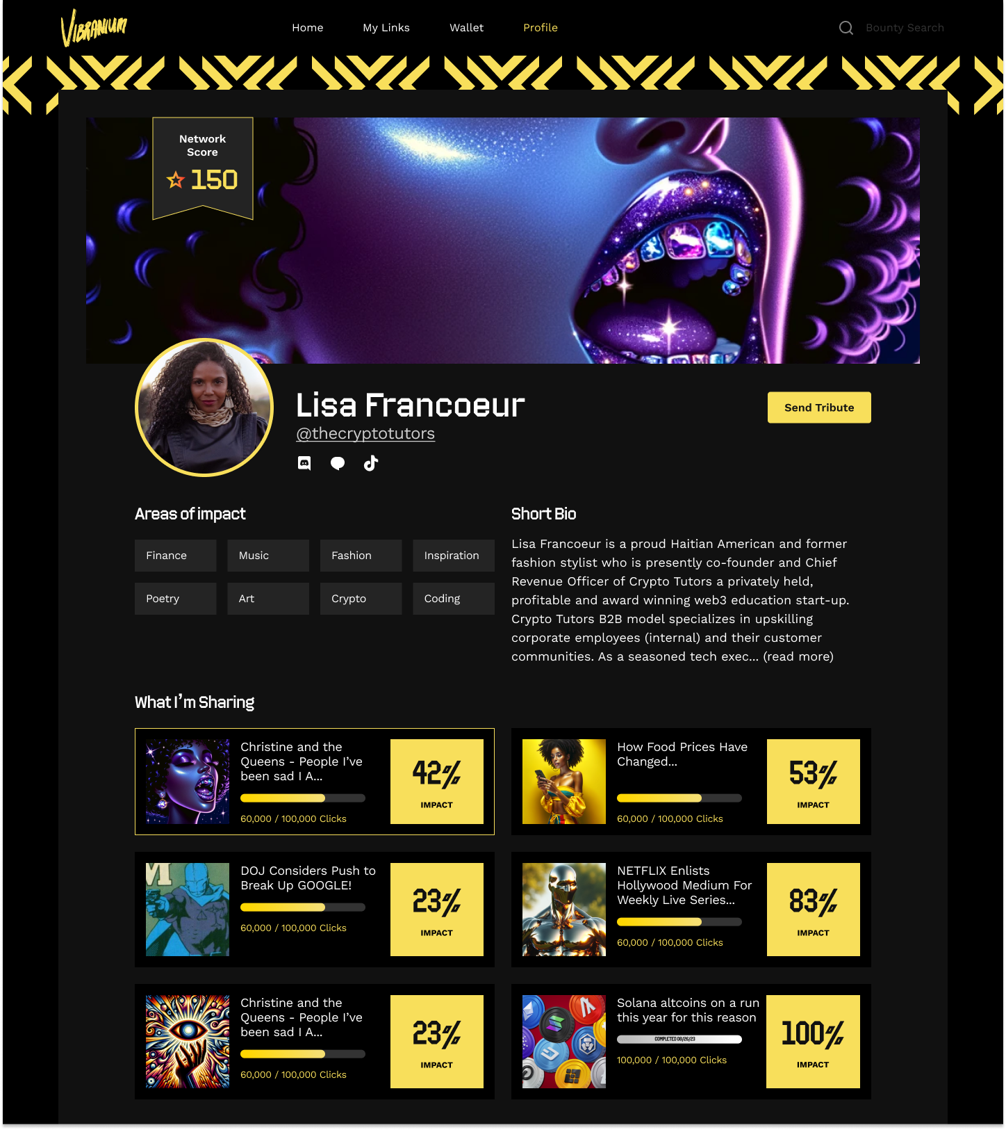
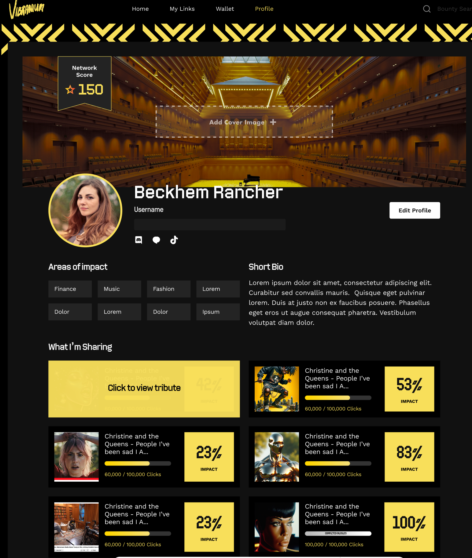
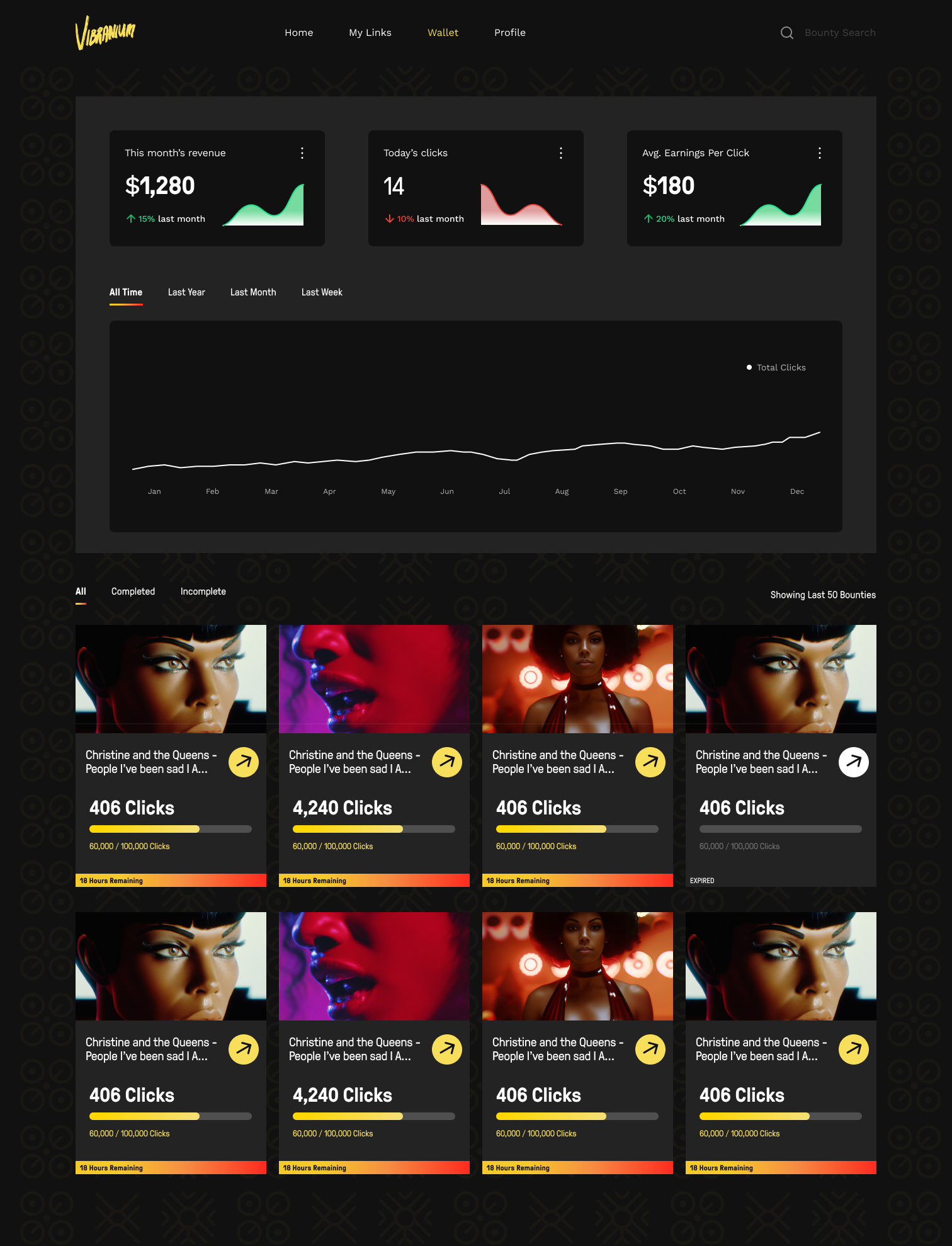
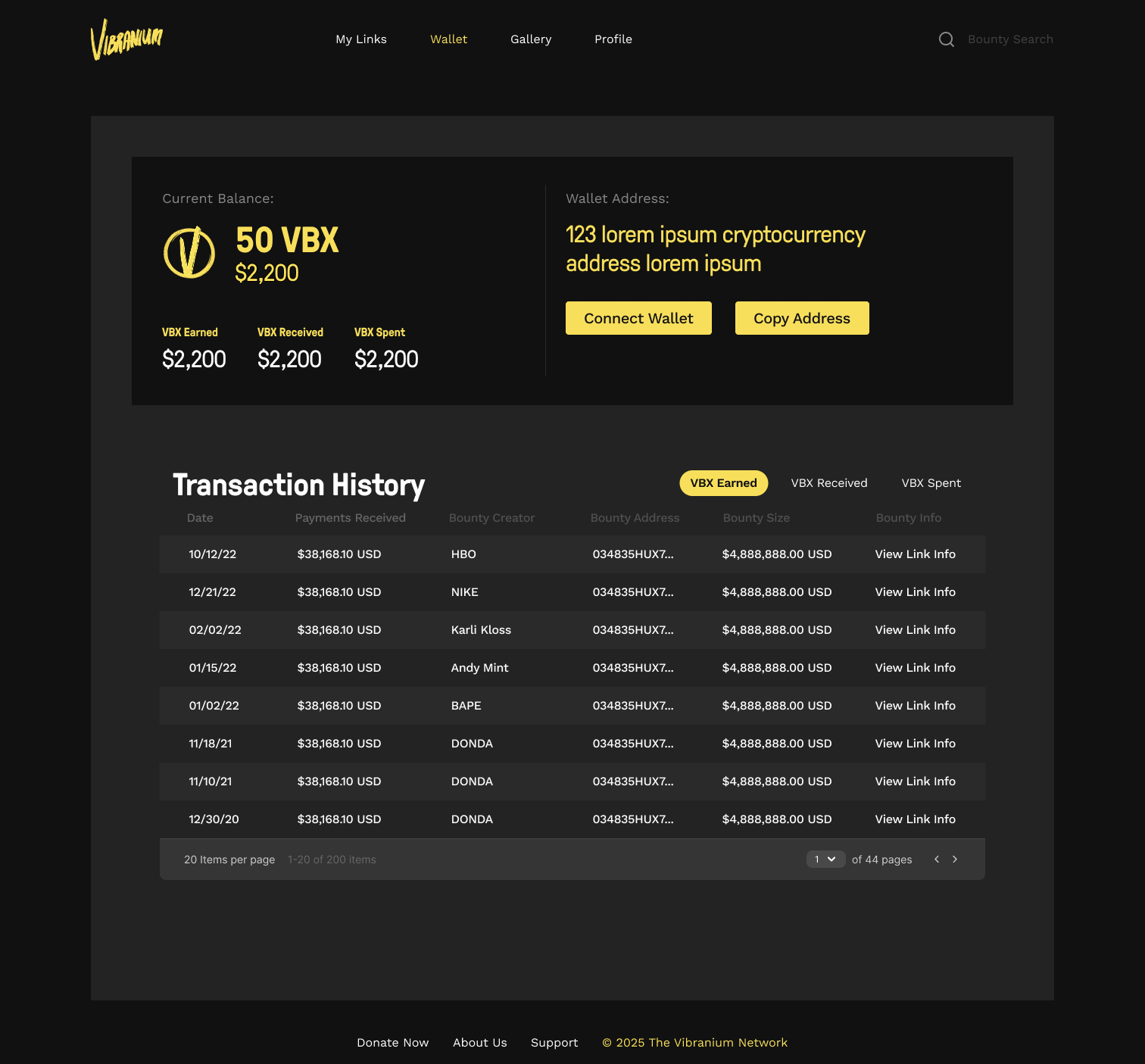
Tribute feed with realtime earnings and traffic counts
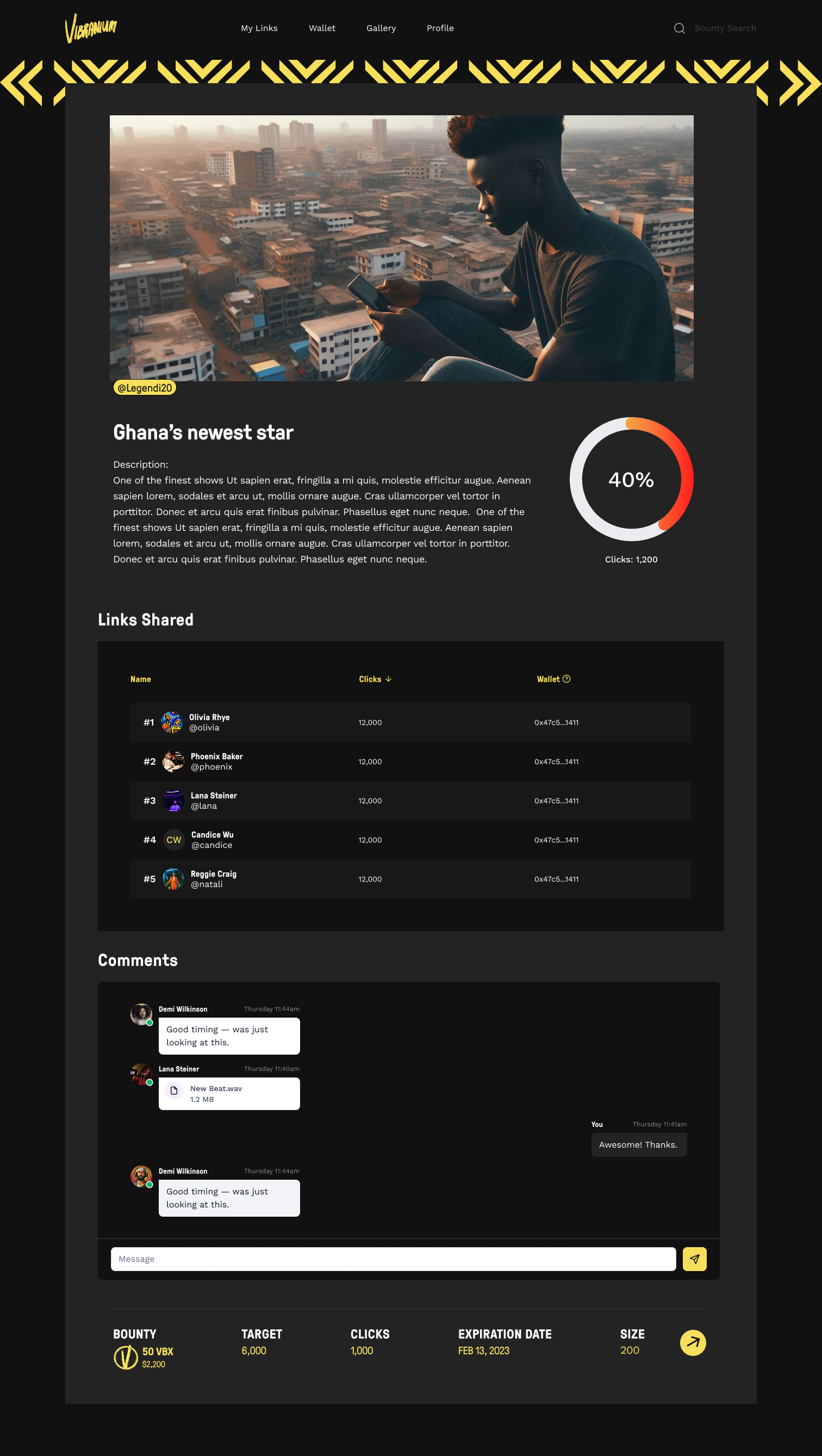
Each piece of content has a dedicated chatroom and share history
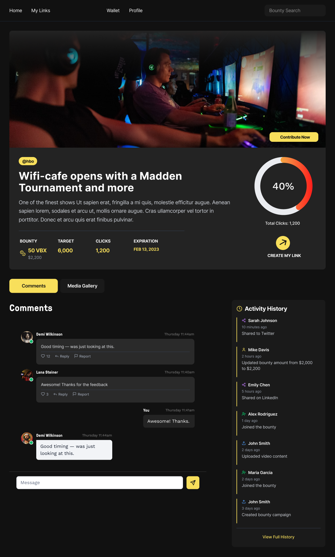
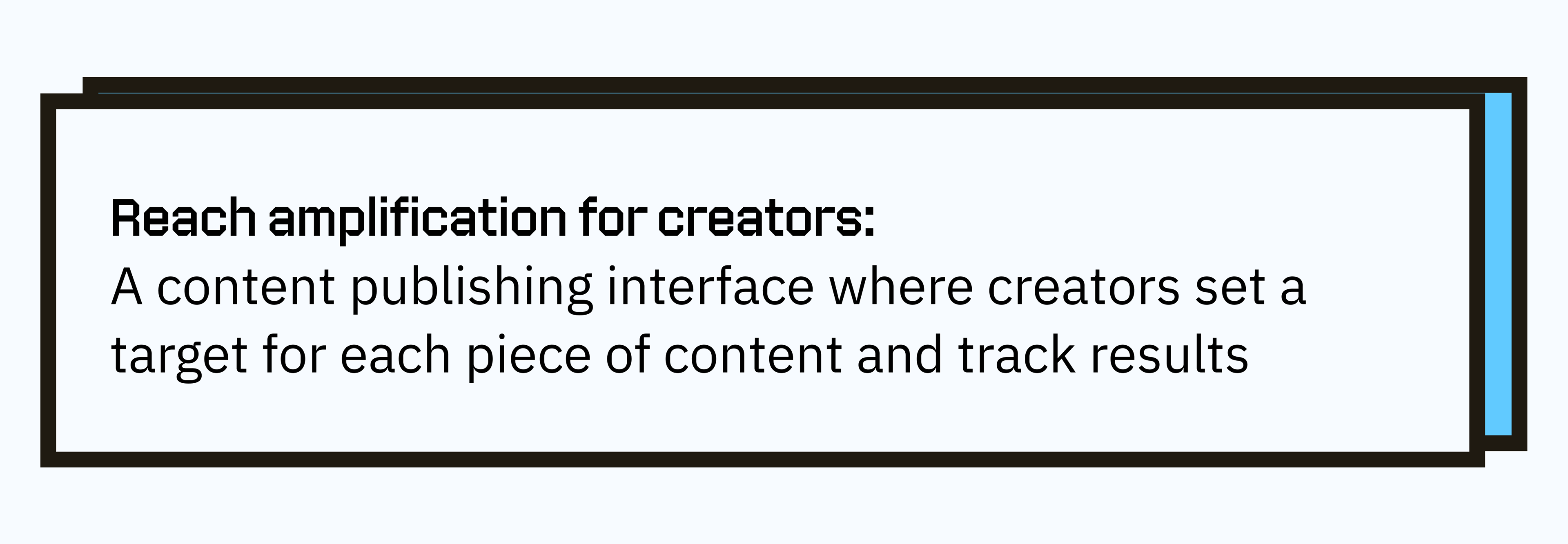
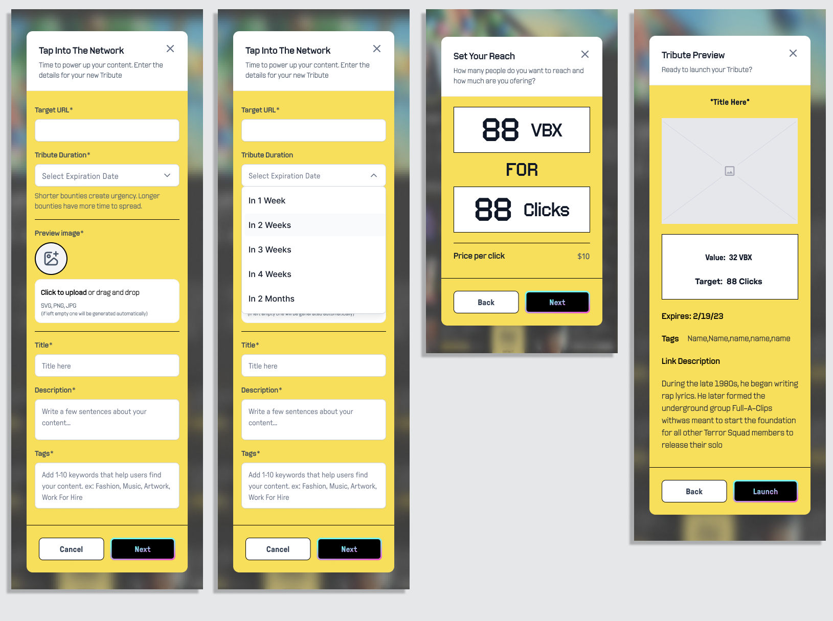
Robust targeting capabilities for creators launching promotional campaigns
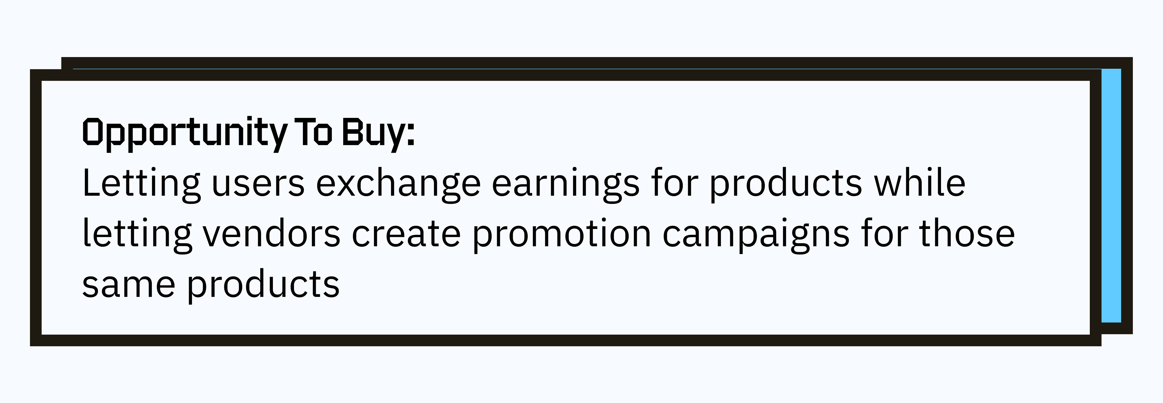
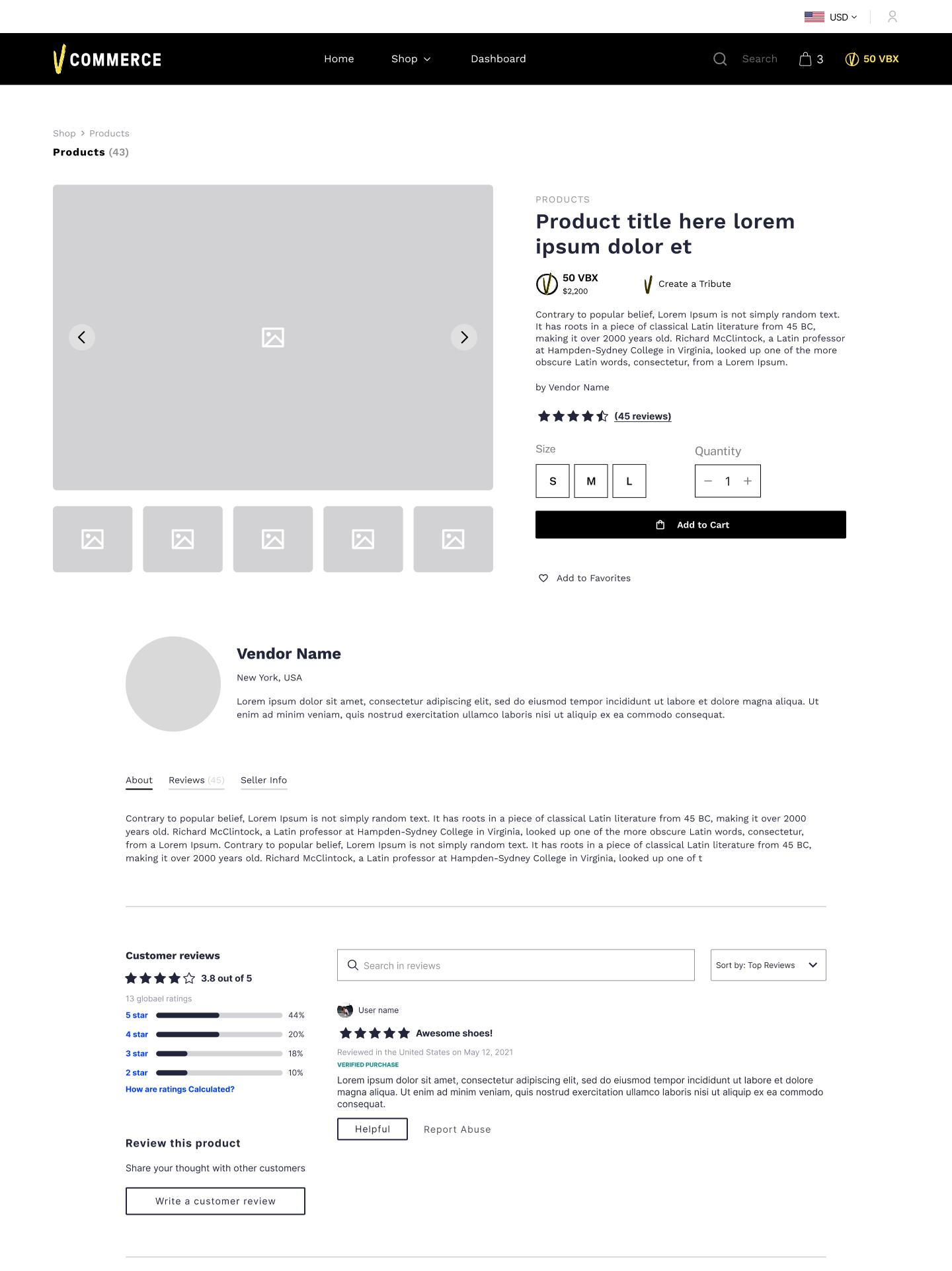
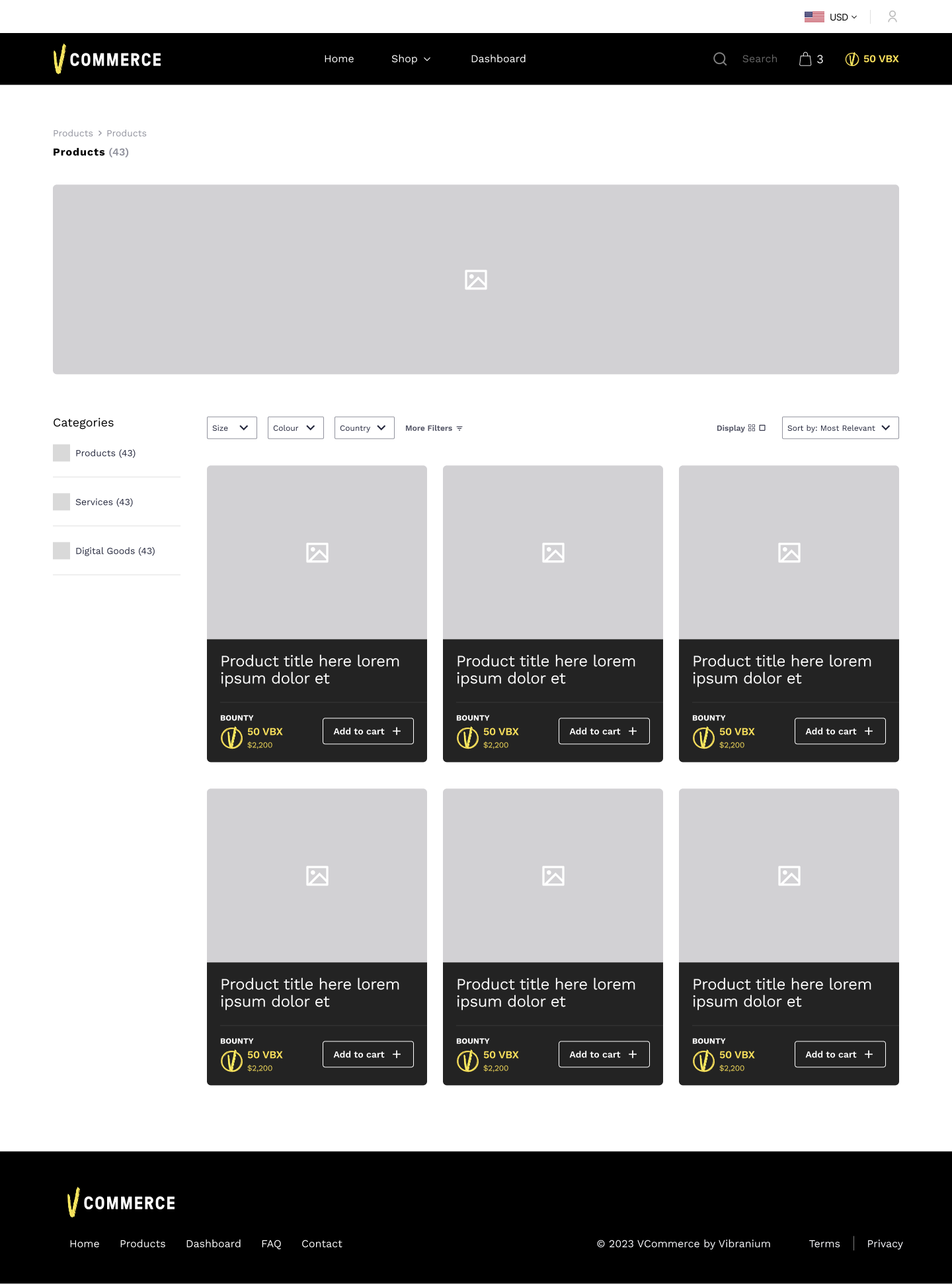
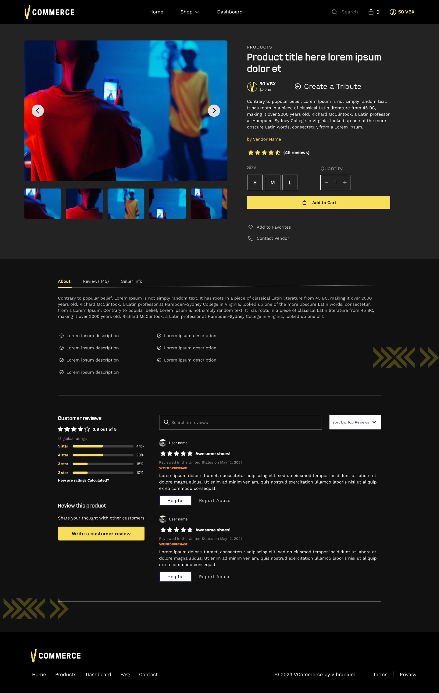
The shop mirrors the campaign creation features of the influencer platform.